
iPhone Game Illustrations
in portfolio
portfolio
 Illustrations
Client: May
 This was a small project I did for Ben Pasley for a Ning site that brings worshipping musicians together to share ideas and information about playing house concerts. You can read more on the website if you're interested.


On Wednesday Tim Thornton (half of The Blackthorn Project) emailed me asking if I would be willing to design some album covers for a new collection of songs called "Simple Series" they will be offering on iTunes, as well as from their website. Here are two ideas I created for them:


They have decided to go with the first concept, as they like how the two birds represents them. And with each new volume they release, there will be slight variations to the cover art. Whether it's a new layout or just simple color changes, each one will be unique. So make sure you subscribe to their podcast below, even if it's just for the artwork. :)
But honestly, Tim and Laurie Thornton are two wonderful people who I have had the pleasure of meeting. Their music is made with a heartfelt passion for the Heavenly Father. If you would like to support The Blackthorn Project by purchasing their music, hosting them at your house, or simply giving them a donation please visit their website → theblackthornproject.com.
You can also subscribe to The Blackthorn Project Podcast
 A few weeks ago my fellow twitterer @ableparris posted a tweet asking if anyone was interested in doing a twitter mix cd.

And since I'm a huge lover of music and design I knew this would be a be a fun project to work on. So this weekend I finally had some room to breath, and with a little creative nudge from my friend Alex I got crackin' on my mix cd packaging design.
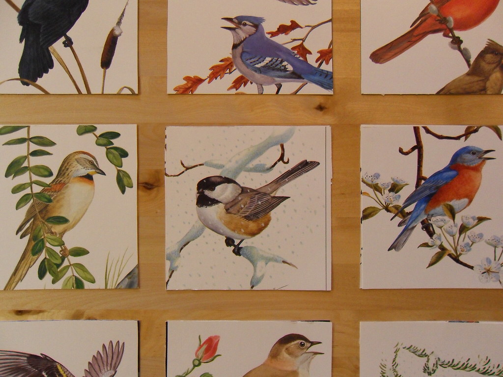
I wanted to keep things simple and consistent, but I didn't have a clear vision of how I wanted it to look. So as I began rummaging through my old book collection I came across the perfect solution. It was a book of bird illustrations I bought a couple years ago and had forgotten about until just then. It was perfect.

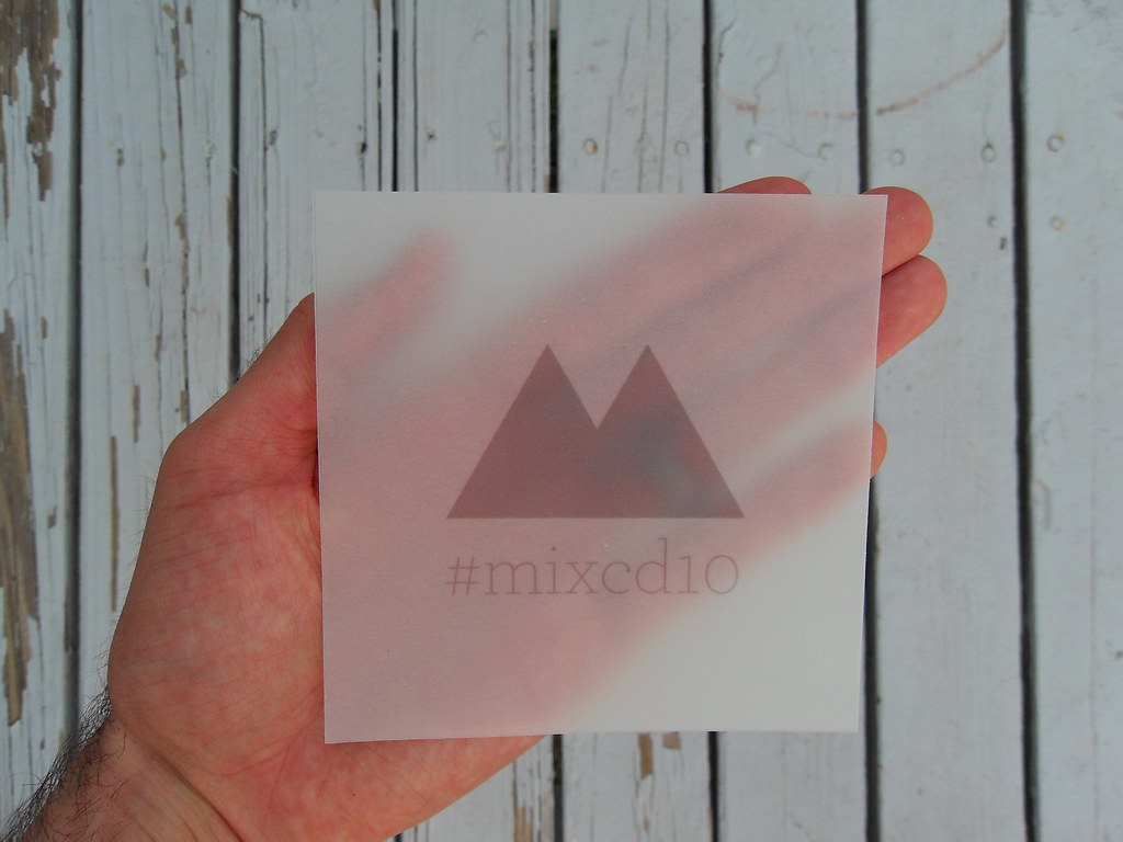
The insert of the packaging is a sleek contrast to the exterior. I created my playlist and overlay templates in Photoshop. Then I printed the playlist on graph paper and used a heavy-stock vellum paper to print the overlay on. The results turned out quite nice for using just an all-in-one printer. But that's just my awesome design skills in effect, well that and the fact that I used the Archer typeface. mmm...
You can view the full set on flickr here.
PS - I have one extra copy to give away. So if you are interested in getting your hands on one of these beauties, and like listening to good music, leave me your best comment below. I'll pick the winner this Friday (the 15th).
Congrats to Garth Humbert (@iamgarth) for winning the extra copy.
 These graphical charts at work have kept me really busy. And in the midst of all the pixels floating around I was able to come up with this little beauty. I think this is a more timeless icon that can extend across a wide variety of projects and personal uses.
I was really pleased with the response I got yesterday from my box icons that I wanted to share this one with you all as well. Below you can see a preview (all to size except the original) of what you can download for free.

Contained in the zip file you will find all three sizes listed above. Please note that I did not include the original PSD file this time. Also, please take a look at the "readme" note for further contact info. And I hope you enjoy this new icon as much as I enjoyed creating it.